ChatView
Effortless Messaging Integration: Add a Complete Chat Interface to Your Dapp with ChatView Component.
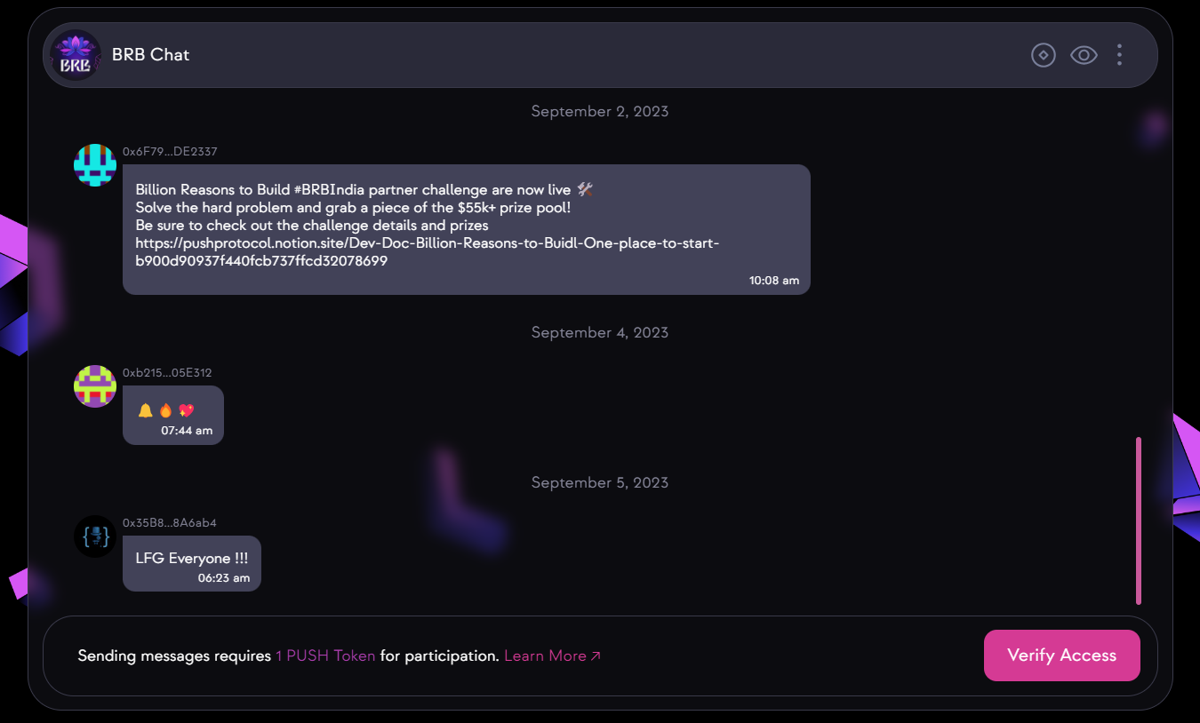
If you want to easily add a chat feature to your application without dealing with complex API calls, this is the solution for you. With the Chat View component, you get everything you need for a chat interface, including the chat profile, input box, and message list, all in one simple package. Say goodbye to the hassle of integrating individual components or making API calls. Just input your chat ID and customize it as needed – it's that easy!
Usage
- react
import { ChatView } from "@pushprotocol/uiweb";

const ChatViewTest = () => {
  return (
    <div>
      <ChatView
        chatId="89f7b382b9b1496dca2b9a94ef87c80dd102db05dcb40b165fabfab28770fd55"
        limit={10}
        verificationFailModalPosition={MODAL_POSITION_TYPE.RELATIVE}
      />
    </div>
  );
};

export default ChatViewTest;
Customization parameters
| Param | Type | Default | Remarks |
|---|---|---|---|
chatId | string | - | Chat id for a particular chat |
emoji | boolean | true | Default value is true, decides if the input field will have emoji option |
gif | boolean | true | Default value is true,decides if the input field will have gif option |
file | boolean | true | Default value is true,decides if the input field will have file upload option |
isConnected | boolean | true | Default value is true,shows the connect button if signer, account and pgpPrivateKey is not passed |
autoConnect | boolean | false | Default value is false, decrypts pgpPrivateKey after reload if true, or else disconnects the existing wallet connection |
onVerificationFail | function | - | Function to perfom any task on gating access verification fail modal |
messageInput | boolean | true | Default value is true,decides whether to show the message input field |
chatProfile | boolean | true | Default value is true, decides whether to show the chat profile header |
chatViewList | boolean | true | Default value is true,decides whether to show the message list |
groupInfoModalBackground | ModalBackgroundType | - | Default value is "OVERLAY", decides the group info modal background, possible values are "OVERLAY" | "BLUR" | "TRANSPARENT" |
groupInfoModalPosition | ModalBackgroundType | - | Default value is "GLOBAL", decides the group info modal position, it can be either relative to immediate parent(RELATIVE) or the entire screen(GLOBAL), possible values are "RELATIVE" | "GLOBAL" |
verificationFailModalBackground | ModalBackgroundType | - | Default value is "OVERLAY", decides the access gating verification fail modal background, possible values are "OVERLAY" | "BLUR" | "TRANSPARENT" |
verificationFailModalPosition | ModalBackgroundType | - | Default value is "GLOBAL", decides the access gating verification fail modal position, it can be either relative to immediate parent(RELATIVE) or the entire screen(GLOBAL), possible values are "RELATIVE" | "GLOBAL" |
chatFilterList | Array<string> | - | Array of cid's of messages that needs to be excluded from chatViewList |
limit | number | - | Number of messages fetched in each paginated api call,default value is 10 |
chatProfileRightHelperComponent | React.ReactNode | - | Custom React component that will be displayed on the right side of chat profile header |
chatProfileLeftHelperComponent | React.ReactNode | - | Custom React component that will be displayed on the left side of chat profile header |
welcomeComponent | React.ReactNode | - | Custom React component that will be displayed if chatId is not passed on. This is the welcome screen of the chat View component |
Note: Refer ChatUIProvider for details on its paramters.
Live playground
// DO NOT FORGET TO IMPORT LIBRARIES// NOT NEEDED HERE SINCE PLAYGROUND IMPORTS INTERNALLY
// import { ChatUIProvider, ChatView } from @pushprotocol/uiweb;
function App(props) {
  return (
    <>
      <h2>
        Live chat with pushai.eth, connect your wallet and chat to get sassy
        response from PushAI.eth
      </h2>
      <div style={{ height: '75vh', margin: '20px auto' }}>
        <ChatUIProvider>
          <ChatView
            chatId='0x99A08ac6254dcf7ccc37CeC662aeba8eFA666666'
            limit={10}
            isConnected={true}
            autoConnect={false}
            verificationFailModalPosition={MODAL_POSITION_TYPE.RELATIVE}
          />
        </ChatUIProvider>
      </div>
    </>
  );
}
LIVE PREVIEW