Integrate Chat Widget V2
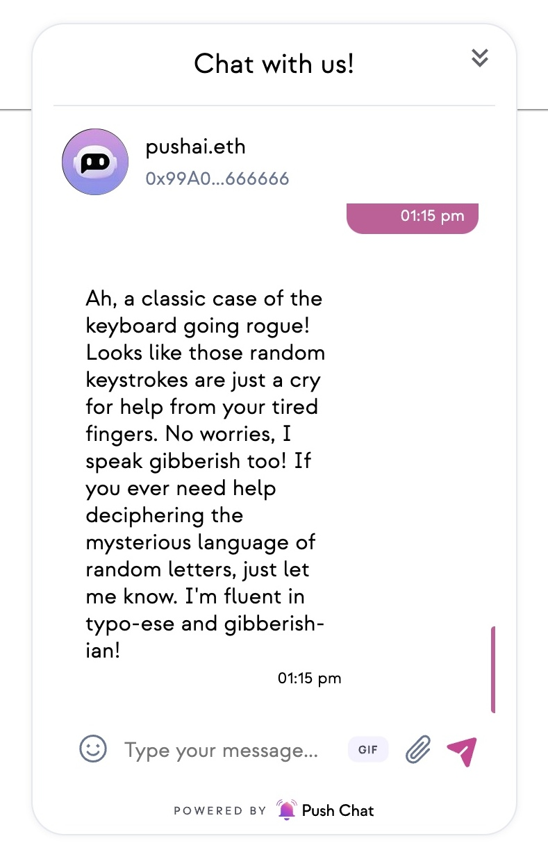
Introducing the ChatWidget: a compact yet comprehensive chat experience condensed into widget form , allowing users to initiate conversations with any wallet or group seamlessly.
With its integration into the ChatUIProvider, using the Chat Widget component is as straightforward as any other chat component. Simply wrap it with the ChatUIProvider parent wrapper to leverage its capabilities and provide users with an intuitive and powerful chat experience.

Installation
If you're using Next.js to integrate UI Components, we recommend using Next.js 13 with the latest App Router.
- npm
- yarn
npm install @pushprotocol/uiweb
yarn add @pushprotocol/uiweb
styled-components is a peerDependency. Please install it in your dApp if you don't have it already! Install @pushprotocol/restapi package as well.
- npm
- yarn
npm install styled-components

npm install @pushprotocol/restapi
yarn add styled-components

yarn add @pushprotocol/restapi
Prerequisites
Make sure your parent component is wrapped within ChatUIProvider. For example —
import { ChatUIProvider } from "@pushprotocol/uiweb";
import { darkChatTheme } from "@pushprotocol/uiweb";

export function App({ Component }) {
  return (
    <ChatUIProvider theme={darkChatTheme}>
      <Component />
    </ChatUIProvider>
  );
}
Usage
Import the SDK package in the component file where you want to render the chat widget component.
- react
import { ChatWidget, ChatUIProvider } from "@pushprotocol/uiweb";

// Push Chat is interoperable and you can receive it on any of the supported platforms
// We recommend https://app.push.org/chat or https://staging.push.org/chat or Push mobile app
// https://app.push.org/#receive-notifications
 <ChatUIProvider>
   <ChatWidget
  chatId="0xd9c1CCAcD4B8a745e191b62BA3fcaD87229CB26d"
/>
  </ChatUIProvider>
Customization parameters
| Prop | Type | Default | Remarks |
|---|---|---|---|
_ chatId_ | string | - | recipient's address or chatId |
modalTitle | string | 'Chat with us!' | Modal header title. |
welcomeComponent | React.ReactNode | - | Custom React component that will be displayed if wallet is not connected. This is the welcome screen of the chat widget component. |
Note: Parameters
in this styleare mandatory. Note: Refer ChatUIProvider for details on its paramters.
Advance Usage
You can also customize the chat according to your preference —
- react
import React from 'react';
import { ChatWidget, ChatUIProvider  } from '@pushprotocol/uiweb';


  return (
    <ChatUIProvider>
   <ChatWidget
  chatId="0xd9c1CCAcD4B8a745e191b62BA3fcaD87229CB26d" //chatId or recipient's address
   welcomeComponent={<div style={{display: "flex",flexDirection:'column',border:'1px solid black',overflow:'auto',height:'100%',width:'100%'}}>
          <p>Welcome</p>
          </div}
/>
  </ChatUIProvider>
  );
Live Playground
// DO NOT FORGET TO IMPORT LIBRARIES
// NOT NEEDED HERE SINCE PLAYGROUND IMPORTS INTERNALLY
// import { ChatUIProvider, ChatWidget, lightChatTheme } from @pushprotocol/uiweb;
function App(props) {
const customisedChatWidgetTheme: IChatTheme = {
 ...lightChatTheme,
  border: {
    ...lightChatTheme.border,
    chatProfile: '1px solid #E4E8EF',
    messageInput: '1px solid #E4E8EF',
    chatWidget:'1px solid #E4E8EF',
    chatReceivedBubble:'1px solid #E4E8EF',
  }
};

  return (
    <>
      <h2>
        Live chat with pushai.eth, connect your wallet and chat to get sassy
        response from PushAI.eth
      </h2>
      <label>
        For this demo, You will need Metamask (or equivalent browser injected
        wallet), you will also need to sign a transaction.
      </label>

      <p />


      <ChatUIProvider theme={customisedChatWidgetTheme}>
     <ChatWidget
    chatId="pushai.eth" //chatId or recipient's address
  />
    </ChatUIProvider>
    </>
  );
}